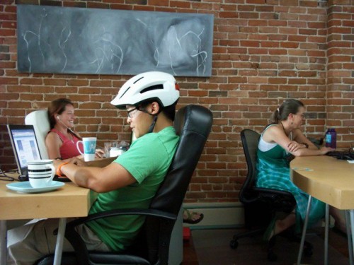
I think we can agree that Cohere is a pretty cool group of motivated, interesting, independent professionals that love to work together. As we contemplate the future of this kick-ass community, it’s helpful to assess how we’re using it and how we might do so more efficiently.
Cohere coworking has been keeping tabs on how and when members are utilizing the space. Our industrious intern Phil put together the following graphs based on our raw data which we gathered by writing member’s names down if they coworked on any given day.
Apologies in advance if this gives any of you flashbacks to your corporate job. Please refrain from going all Office Space on the printer.
The below graph shows the total number of visits by month since January. The exceptionally low attendence in March can be attributed to 2 full time members missing over a week each to attend SXSW. The dip in June is inexplicable other than the weather being so amazing that many freelancers found themselves out working under a tree and not at a desk.
The following chart displays the average number of daily visits by week since January. Notice the spike in late February followed by a huge dip due to members attending SXSW in early March.
Note: membership continued to rise over this period from roughly 22 to 42 members even though attendance slightly drops.

The last graph (below) shows the total number of visits for each day of the week, January to June.
Why should you care about this? Good question.
First, this is your community. Without you, it disappears. You keep coming, so we keep growing. Congrats!
Second, “openness” is a core value of the coworking movement. This term is open to interpretation, but at Cohere, it means that I try to share as much information about the state of the business as is possible and practical. We sometimes hold Town Meetings to accomplish this, but if you ever wonder about why or how we do something, just ask.
Third, many of you know that Cohere recently went on a membership waiting list for the first time since our opening. This means that we currently have more members than seats, but as the graphs demonstrate, you never all show up at the same time on the same day. Cohere is a different workspace depending on the number and personality of members in attendance. Hopefully, this data helps you to see patterns attendance which will allow you to choose the best days to come in.
Fourth, as freelancers in the information age, we know that there can never be too much data about a community, whether it exists on-line, in the real world, or both. It’s my desire to know as much about this community and how you use it as possible, so that we can make informed decisions about our future. I hope that you’re doing the same for your business. If you ever want to talk charts and data tracking, just holler.


Cohere Insight: Coworking Attendance Data #coworking http://t.co/mhuwBOK
Since Friday is typically the lowest attendance, maybe you should give the old plan of choosing your day to come in each week for that day for the peeps on the waitlist?
Good idea! I did do that with a couple of wait listers who wanted to work on Fridays. I’ve taken everyone off the wait list and moved them to membership for August. We’re up to 45 members now!
RT @CohereLLC: Cohere Insight: Coworking Attendance Data #coworking http://bit.ly/prGKHR